 Visual Paradigm Desktop |
  Visual Paradigm Online


When diving into system analysis and process modeling, few concepts create as much confusion as the Data Flow Diagram (DFD). It is a staple in software engineering, business analysis, and architecture. Yet, despite its longevity, there remains a significant amount of misunderstanding regarding what it is and what it is not. Many practitioners mistake it for a flowchart or believe it captures logic flow. These misconceptions can lead to flawed system designs, confusing documentation, and development delays.
This guide strips away the noise. We will examine the most persistent myths surrounding Data Flow Diagrams, clarify the technical realities, and provide a robust framework for accurate modeling. Whether you are designing a new application or auditing an existing one, understanding the truth behind these diagrams is essential for success.
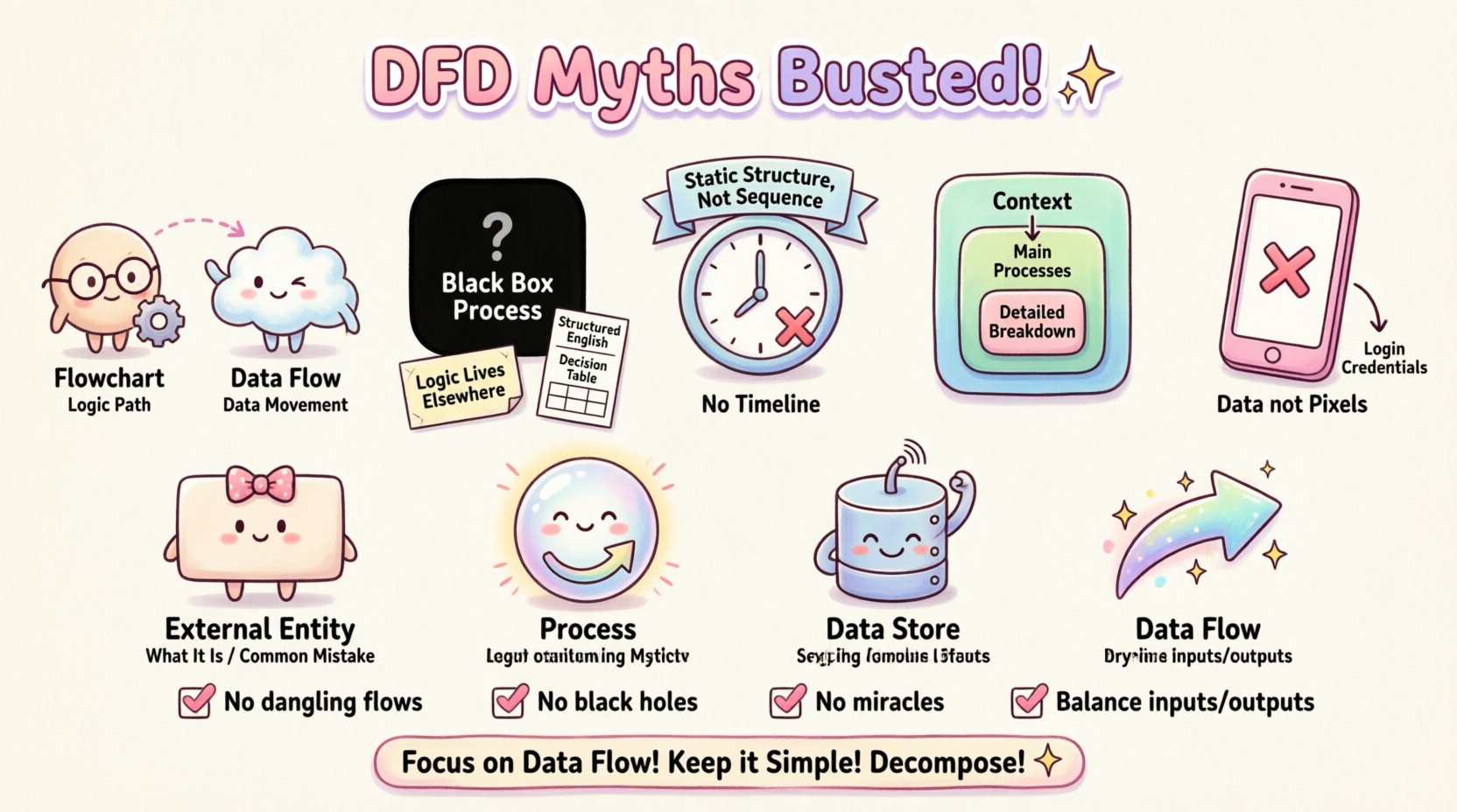
The most pervasive myth is that a Data Flow Diagram is simply a fancy flowchart. While they share visual similarities, their purpose and notation are fundamentally different. Confusing the two leads to models that describe how a system thinks, rather than what data moves where.
If you attempt to represent a complex decision tree in a DFD, you lose clarity. DFDs are not designed to show the order of execution. They are designed to show the dependency of data. A process might happen before another, but in a DFD, the order does not matter as long as the data flow is accurate. This distinction is critical when mapping out asynchronous systems or distributed architectures.
Another common error is assuming that a DFD explains the internal logic of a process. When looking at a process bubble (circle), a stakeholder might ask, “What happens inside here?” The DFD does not answer this.
A process in a DFD is a black box. It accepts input data flows and produces output data flows. The internal algorithms, conditional statements, or business rules are not represented. This is not a limitation; it is a feature. It allows analysts to zoom out and view the system at a high level without getting bogged down in code-level details.
Attempting to force logic into the diagram creates clutter. It obscures the data movement, which is the primary goal. If you need to show logic, use a flowchart or a sequence diagram. Reserve the DFD for data.
Readers often look at a DFD and assume the position of elements indicates a sequence. They might think the process on the left happens before the process on the right. This is incorrect.
DFDs are static representations of a system’s structure, not a timeline. They do not show:
This static nature is why DFDs are excellent for requirement gathering. They define the scope of data requirements without imposing temporal constraints that might change. A real-time system and a batch-processing system might have the exact same DFD, even though the timing of their operations is vastly different.
There is a temptation to make a Data Flow Diagram incredibly detailed. Some believe that a single diagram containing every single transaction and data point is superior. In reality, this leads to a “spaghetti diagram” that is impossible to read.
The principle of decomposition is key. You start with a Context Diagram (Level 0), which shows the system as one process interacting with external entities. Then, you decompose that process into Level 1, then Level 2, and so on. Each level adds detail to the specific area of interest.
If you try to cram all levels into one view, you lose the ability to see the big picture. A good model balances high-level overview with specific detail where needed. Complexity should be managed through hierarchy, not density.
Modern interfaces often confuse the data flow. Stakeholders want to see the screens, buttons, and user interactions in their diagrams. While user interaction is vital, it belongs in Use Case Diagrams or Wireframes, not DFDs.
DFDs track data, not pixels. A button click is an event that triggers a process. The DFD cares about the data passed to that process (e.g., “Login Credentials”), not the visual button itself. Mixing UI elements into a data flow diagram distracts from the actual movement of information through the system.
To bust these myths, we must understand the building blocks. A standard DFD consists of four main elements. Confusion here fuels the myths listed above.
| Element | Shape | Function | Common Misconception |
|---|---|---|---|
| External Entity | Rectangle | Source or Destination of data outside the system | Thinking it is a database inside the system |
| Process | Circle or Rounded Box | Transforms input data into output data | Thinking it shows logic or code |
| Data Store | Open Rectangle | Places where data rests at rest | Thinking it represents a file folder only |
| Data Flow | Arrow | Movement of data between elements | Thinking it represents control signals |
Beyond myths, there are practical errors that compromise the integrity of the model. Use this checklist to audit your work.
One of the most tangible consequences of DFD myths is poor database design. If you treat a DFD as a flowchart, you might design tables based on process sequences rather than data entities.
When a DFD is accurate, the Data Stores become the blueprint for your database schema. The data flows indicate the relationships between tables. If you ignore the data store element, you risk creating a database that cannot support the required data movement. For example, if a DFD shows a “Customer Order” flow going to a “Stock Inventory” store, the database must link these entities. If the DFD is unclear, the foreign keys might be missing or incorrectly defined.
Furthermore, understanding that DFDs do not show logic prevents you from over-normalizing the database based on process steps. You normalize based on data dependencies, not transactional order. This distinction saves hours of refactoring later in the development cycle.
So, how do you proceed without falling into these traps? Follow this structured approach to build a reliable Data Flow Diagram.
List everyone or everything outside the system boundary that interacts with it. This includes users, other systems, or regulatory bodies. Do not include internal departments unless they act as a separate system.
Create the Level 0 diagram. Place the entire system as a single process in the center. Draw lines connecting external entities to this process. Label the lines with the primary data being exchanged (e.g., “Request Form”, “Payment Receipt”).
Break the central process into major sub-processes. These should be the main functions of the system (e.g., “Process Order”, “Update Inventory”, “Generate Report”). Ensure that all data entering the system in the context diagram still enters somewhere in this level.
Identify where information needs to be saved. If data flows between processes without being saved, it is just a flow. If it persists, it is a store. Connect these stores to the relevant processes.
This is the most critical technical step. The inputs and outputs of a parent process must match the sum of the inputs and outputs of its child processes. If a data flow enters the Level 0 process, it must appear in the Level 1 decomposition. If it disappears, you have a logical error.
Why does this matter? The cost of getting DFDs wrong is not just a pretty diagram. It is a real-world impact on project delivery.
By adhering to the principles of DFDs—focusing on data, ignoring logic, and respecting hierarchy—you mitigate these risks. The model becomes a contract between the business and the technical team.
Mastering the Data Flow Diagram requires discipline. It requires resisting the urge to show everything at once. It requires accepting that a diagram is a representation, not the reality itself. It demands a clear distinction between data movement and logical flow.
When you strip away the myths, the DFD becomes a powerful tool. It clarifies requirements, exposes gaps in logic, and serves as a communication bridge. It is not about making a pretty picture. It is about ensuring that the information flowing through your system is accounted for, secure, and efficient.
Take a hard look at your current models. Are you showing logic where you should be showing data? Are you confusing sequence with dependency? Are you overloading a single diagram with too many levels? Correcting these misunderstandings will elevate the quality of your system analysis significantly. Focus on the data. Keep it simple. Decompose where necessary. And always balance your flows.
In the end, a good DFD is one that anyone can read and understand without needing a manual. That is the true measure of success.