 Visual Paradigm Desktop |
  Visual Paradigm Online


Creating effective documentation is a critical skill in system analysis and business process management. When dealing with complex systems, the Data Flow Diagram (DFD) stands out as a powerful tool for visualizing information movement. However, technical artifacts often become barriers rather than bridges when presented to business users, managers, or clients. The challenge lies in translating technical logic into visual narratives that non-technical stakeholders can grasp without confusion.
This guide explores how to construct Data Flow Diagrams that serve as universal communication tools. By focusing on clarity, context, and simplicity, you can ensure that every diagram contributes to shared understanding rather than creating new ambiguity. We will cover the foundational elements, design principles, and strategies for presenting these diagrams effectively to diverse audiences.
A Data Flow Diagram is a graphical representation of the flow of data through an information system. Unlike a flowchart, which maps control flow and decision points, a DFD focuses strictly on the movement of data. It answers the question: “Where does information come from, where does it go, and how is it stored?”
For non-technical stakeholders, the DFD is less about code and more about business logic. It represents the “what” and “where” of data without necessarily detailing the “how” of implementation. This distinction is vital. When you strip away the technical implementation details, the DFD becomes a map of the business operations themselves.
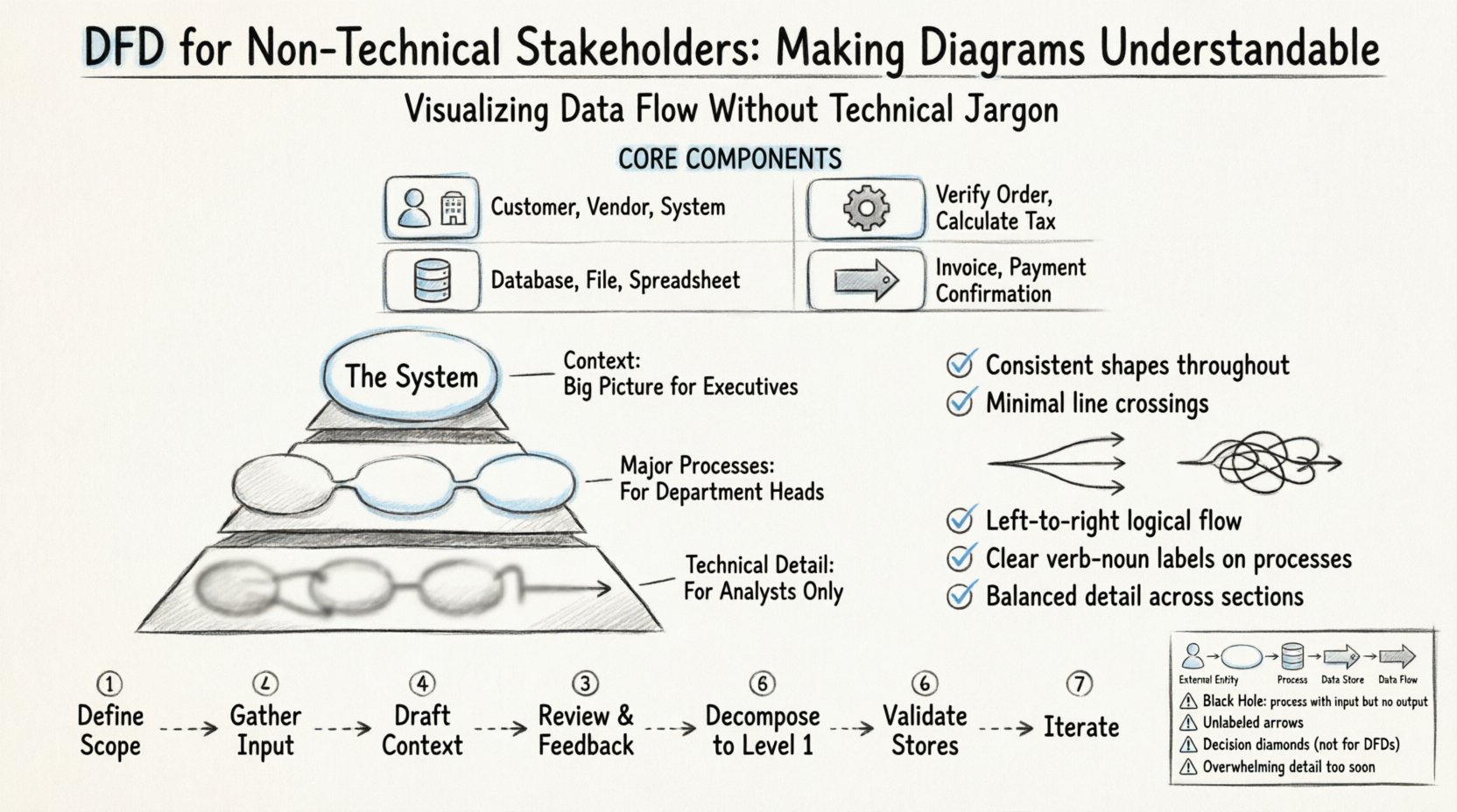
Before diving into design, it is essential to understand the building blocks. Every DFD consists of four primary elements. Using standard terminology helps, but explaining the meaning in business terms ensures comprehension.
The primary goal of a DFD is communication. If the diagram cannot be understood by the people who own the business process, it has failed its purpose. Here is why clarity matters for non-technical teams:
One of the most common mistakes in creating DFDs is providing too much detail too soon. Non-technical stakeholders often get overwhelmed by complex networks of lines and boxes. To avoid this, use a layered approach.
This is the high-level overview. It shows the entire system as a single process bubble. It identifies all external entities and the major data flows entering or leaving the system. This is the perfect starting point for a meeting with executives. It answers: “What does this system do for us?”
Once the context is approved, you decompose the single bubble into the major sub-processes. This level breaks the system down into functional areas. For example, a “Order Management System” might break down into “Receive Order,” “Process Payment,” and “Ship Goods.” This level is suitable for department heads.
This level is generally reserved for technical teams and analysts. It shows the specific logic within a Level 1 process. For non-technical stakeholders, this level is often unnecessary unless they need to understand a specific, complex workflow in depth.
Even with the right levels, a poorly designed DFD can be confusing. Visual design impacts cognitive load. Follow these principles to ensure your diagrams are accessible.
While standards exist, consistency within your own documentation is more important than adhering strictly to a specific standard. However, using recognizable symbols helps.
| Element | Shape Description | Business Meaning |
|---|---|---|
| External Entity | Square or Circle | Who or what provides or receives data (e.g., User, Vendor) |
| Process | Rounded Rectangle | What happens to the data (e.g., Calculate, Validate, Store) |
| Data Store | Open Rectangle | Where data is kept (e.g., File, Database, Log) |
| Data Flow | Arrow | The movement of information (e.g., Report, Request, File) |
Stakeholders often confuse DFDs with other types of diagrams. Managing expectations is part of the design process. Be clear about what a DFD is not.
| Misconception | Reality |
|---|---|
| DFDs show decision logic (Yes/No) | DFDs show data movement. Decision logic belongs in a flowchart or state diagram. |
| DFDs show the order of operations | DFDs are not time-based. They show relationships, not sequence. |
| DFDs show the technical code structure | DFDs focus on business data, not software architecture or code modules. |
| DFDs show user interface screens | DFDs focus on data behind the scenes, not what the user sees on a screen. |
Follow this workflow to develop diagrams that resonate with your audience. This process prioritizes feedback and iteration.
Define the boundaries of the system. What is inside the system, and what is outside? Involve stakeholders early to agree on these boundaries. If a stakeholder expects a feature to be included but it is outside the scope, they will be confused later.
Interview the users. Ask them about their daily tasks. What information do they receive? What do they produce? What documents do they file? This information forms the data flows and entities.
Start with the big picture. Draw the single system bubble. Connect the external entities. Do not add internal processes yet. Show only the major inputs and outputs. This is your first checkpoint.
Present the Context Diagram. Ask specific questions: “Does this capture all your main inputs?” “Is there anything missing?” “Are these labels correct?” Do not ask “Do you understand this?” Instead, ask “Does this match your understanding of the workflow?”
Once the context is approved, break the system bubble into main processes. Ensure every data flow from the context diagram is accounted for in the Level 1 diagram. This ensures nothing was lost in translation.
Check that data is saved appropriately. Is there a place for the data to rest? Ensure that every process that generates data has a path to a data store or an output flow.
Refine the diagram based on comments. Stakeholders might suggest a process should be split or merged. Adjust the layout to make it cleaner. Keep the diagram readable. If it gets too complex, consider splitting it into multiple views.
Presenting a DFD is a skill in itself. How you present the diagram matters as much as the diagram itself.
Even with good intentions, errors can slip into the design. Be vigilant against these common issues.
A DFD is not a one-time document. Business processes change. Systems evolve. A DFD that is accurate today may be outdated in six months. To keep the diagrams useful:
The ultimate success of a DFD is not just its visual accuracy, but its ability to align technical and business teams. When stakeholders understand the data flow, they can make better decisions about resource allocation, risk management, and strategic planning.
By treating the DFD as a communication artifact rather than a technical requirement, you transform it into a shared language. This shared language reduces friction during development and ensures the final system meets actual business needs. The effort invested in making these diagrams understandable pays off in reduced rework and higher user satisfaction.
Remember, the goal is not to prove technical competence but to facilitate understanding. Keep the focus on the flow of information, the transformation of business rules, and the storage of records. When stakeholders see their operations reflected clearly in the diagram, trust is built, and projects move forward with clarity.