 Visual Paradigm Desktop |
  Visual Paradigm Online


Entering the world of software engineering often involves deciphering complex blueprints before writing a single line of code. Among the various diagrams used to map system behavior, the Data Flow Diagram (DFD) stands out as a critical tool for understanding how information moves through a system. Unlike code, which dictates how a task is performed, a DFD illustrates what data is processed and where it travels. For a new engineer, the ability to interpret these diagrams translates directly to faster onboarding, better system architecture understanding, and improved communication with stakeholders.
This guide is designed to take you from a basic understanding of symbols to a nuanced ability to analyze complex process flows. We will explore the anatomy of a DFD, the hierarchy of its levels, and the common pitfalls that indicate modeling errors. By the end, you will have a practical framework for reading these diagrams with confidence and precision.
A Data Flow Diagram is a graphical representation of the flow of data through an information system. It models the system from a functional perspective, focusing on the movement of data rather than the control logic or timing. This distinction is vital. While a sequence diagram shows the order of events, a DFD shows the transformation of data from input to output.
When you look at a DFD, you are essentially looking at a map of your system’s logic. You can identify:
Where data originates: The external sources or entities.
How data changes: The processes that transform input into output.
Where data rests: The data stores where information is kept.
Where data ends up: The destinations or recipients of the processed information.
Understanding this purpose helps you avoid the common mistake of trying to read a DFD like a flowchart. There is no loop, no decision diamond, and no time-based sequence in a standard DFD. It is a static snapshot of dynamic data movement. This abstraction is powerful because it allows engineers to discuss system requirements without getting bogged down in implementation details.
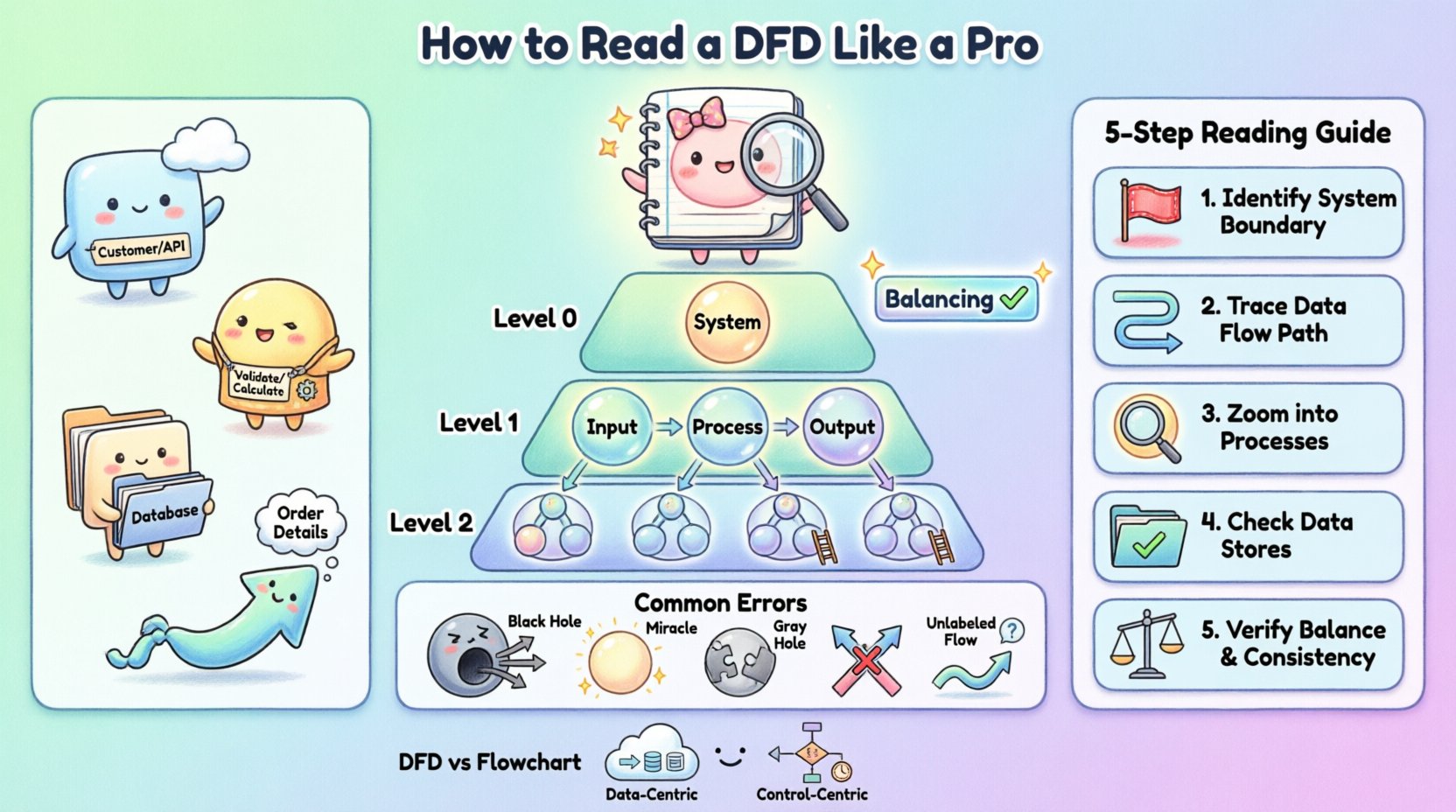
To read a DFD proficiently, you must first recognize its four fundamental components. While notation styles vary slightly between methodologies, the core concepts remain consistent. The following table outlines these elements and their standard visual representations.
Component | Visual Shape | Function | Example |
|---|---|---|---|
External Entity | Rectangle | Source or destination of data outside the system | Customer, Administrator, Third-Party API |
Process | Circle or Rounded Rectangle | Transforms input data into output data | Calculate Tax, Validate User |
Data Store | Open Rectangle or Parallel Lines | Repository where data is stored for later use | Customer Database, Log File |
Data Flow | Arrow | Direction and name of data moving between components | Order Details, Payment Confirmation |
Notice that the labels on these components are not arbitrary. The naming convention is crucial for clarity. A process should be named with a verb and a noun (e.g., “Update Inventory”), indicating an action taken on data. A data store should represent a noun (e.g., “Inventory Log”), representing a collection of records. Data flows must be named to describe the specific content moving along the arrow.
Complex systems cannot be represented in a single diagram without becoming unreadable. To manage complexity, DFDs are structured hierarchically. This approach allows you to zoom in and out of the system, focusing on high-level logic or granular details as needed.
The Context Diagram provides the highest level of abstraction. It shows the system as a single process bubble and illustrates how it interacts with external entities. There are no internal data stores or sub-processes shown here. The goal is to define the boundaries of the system. You will see the system in the center, surrounded by the entities that feed it data and receive data from it. This is the first diagram you should review to understand the scope of the project.
Also known as the Top-Level Diagram, this breaks the single system bubble from the Context Diagram into major subsystems or major processes. It reveals the primary data stores and the high-level flow of data between these major functions. This level is essential for understanding the major modules of the software and how they relate to one another.
These diagrams represent further decomposition. A Level 1 diagram details the processes shown in the Level 0 diagram. A Level 2 diagram goes deeper into a specific process from Level 1. As you descend the hierarchy, the number of processes and data stores increases. However, each individual process on a lower-level diagram must be consistent with the inputs and outputs of the parent process on the higher level.
This concept is known as balancing. If a Level 0 process has an input of “Order Data” and an output of “Receipt,” every child process in the decomposition must collectively account for receiving “Order Data” and producing “Receipt.” This consistency is a key indicator of a well-constructed model.
When you are handed a DFD for a new feature or a legacy system, do not try to memorize the entire image at once. Instead, use a systematic tracing method. This ensures you do not miss connections or misunderstand the logic.
Step 1: Identify the Boundaries. Look for the External Entities. These are the start and end points. Ask yourself, “Who is interacting with this system?” If a process has no connection to an external entity or data store, it might be an isolated component that requires further explanation.
Step 2: Trace the Data Flow. Pick a specific input, such as a “Login Request.” Follow the arrow from the Entity to the Process. Then follow the output arrow to the next Process or Data Store. Do not jump around the diagram; follow one path at a time.
Step 3: Analyze the Processes. For each process bubble, ask, “What is the transformation?” Does the input match the output logically? For example, if a process is named “Calculate Discount,” ensure the inputs include “Price” and “Membership Status.” If the inputs are missing, the diagram is incomplete.
Step 4: Verify Data Stores. Ensure that every data store has at least one read operation (input flow) and one write operation (output flow), unless it is a permanent record that is only updated occasionally. A data store that only receives data but never releases it might be a “sink” error, while one that only releases data might be a “source” error.
Step 5: Check for Balancing. If you are looking at a Level 1 diagram, verify it against its parent Level 0 diagram. Do the inputs and outputs match? If the parent process says “Receive Order,” the child process must also receive “Order” data. If the child process receives “Payment” instead, the diagram is unbalanced.
By following this sequence, you move from the macro view to the micro view, ensuring a comprehensive understanding of the system architecture.
Even experienced engineers make mistakes when creating DFDs. As a reader, spotting these anomalies can save you significant time during development. Recognizing these errors helps you ask the right questions to the system architects.
A Black Hole occurs when a process has inputs but no outputs. The data enters the process and disappears. In a real system, this implies data is being lost. For example, if a “Process User” receives a “Login Form” but produces no output to a database or a confirmation screen, the data has nowhere to go. This indicates a missing requirement or a broken logic path.
A Miracle is the opposite of a Black Hole. It is a process that produces outputs without receiving any inputs. How can a system generate a “Sales Report” without reading “Sales Data”? This suggests that the data is being generated out of thin air, which is impossible in a deterministic system. The missing input must be identified and connected to a data store or an external entity.
This error occurs when the inputs and outputs of a process do not match logically, even if both exist. For instance, if a process is named “Calculate Tax” but the input is “User Address” and the output is “Total Price,” the transformation is incomplete. The tax rate is missing. This often points to a missing data store or an unconnected flow.
In clean DFDs, arrows should not cross each other without a connection. If two data flows cross, it can be ambiguous whether they interact or simply pass by. While some crossing is unavoidable in complex diagrams, it is a sign of poor layout. In a well-designed diagram, flows should be routed clearly to avoid confusion.
Every arrow must have a label. An arrow without a name implies that the specific data content is unknown. If you see an arrow connecting a Data Store to a Process, you must know what data is being retrieved. “Data” is not a specific enough label. It should be “Customer List” or “Active Session Tokens.” Ambiguous labels are a major source of implementation errors.
One of the most common points of confusion for new engineers is the difference between a Data Flow Diagram and a Flowchart. While both use shapes and arrows, their semantics are fundamentally different.
Focus: A Flowchart focuses on control flow. It shows the sequence of operations, decision points (if/else), and loops. It answers “What happens next?” A DFD focuses on data flow. It shows the movement of information. It answers “Where does the data go?”
Logic vs. Data: In a Flowchart, you will see decision diamonds. In a standard DFD, you will not. A DFD assumes the process happens; it does not model the branching logic of that process.
Time: Flowcharts often imply a temporal sequence. DFDs are generally timeless. A DFD does not show which process happens first unless implied by the data dependencies.
Storage: Flowcharts typically do not show data storage explicitly. DFDs explicitly model data stores as a core component.
Understanding this distinction prevents you from trying to find control logic where there is none. If you are looking for the “if this, then that” logic, look at a Flowchart or Pseudocode. If you are looking for where the database is updated, look at the DFD.
Reading DFDs is not just an academic exercise; it is a daily requirement for software engineers. Here is how this skill translates to real-world scenarios.
1. Onboarding and Code Review: When you join a new team, the architecture documentation often includes DFDs. Reading them allows you to understand the data dependencies before you touch the code. During code reviews, you can check if the implementation matches the diagram. If the diagram shows data going to a cache, but the code writes only to the database, you have identified a discrepancy.
2. Debugging and Troubleshooting: When a feature is broken, a DFD helps you trace the path of the data. If a user reports that their profile is not updating, you can follow the “Update Profile” flow on the DFD. You can check which processes are involved and which data stores are accessed. This narrows down the search space significantly compared to searching through code blindly.
3. Requirement Gathering: When working with product managers, you often need to visualize requirements. If you understand DFDs, you can help refine the requirements. You can spot missing data flows or impossible transformations before development begins. This proactive approach reduces technical debt.
4. System Integration: In microservices architectures, DFDs are essential for defining API contracts. You can map the data flows between services to ensure that the output of Service A is compatible with the input of Service B. This prevents integration failures caused by mismatched data formats.
To ensure that the diagrams you read remain useful over time, consider the following practices. A diagram that is outdated is worse than no diagram at all.
Keep it High-Level: Do not clutter a DFD with every variable name. Stick to logical data entities. “User Input” is better than “Name Field Value”.
Use Consistent Naming: Ensure that “Customer” in one diagram is called “Customer” in all related diagrams. Avoid synonyms like “Client” or “User” unless they refer to different entities.
Update During Changes: If the code changes significantly, the DFD should be updated. A version-controlled diagram can serve as a history of how the system evolved.
Limit Complexity: If a single diagram becomes too crowded, it is time to decompose it into lower-level diagrams. A good rule of thumb is that a Level 0 diagram should have no more than 7 to 10 major processes.
Mastering the interpretation of Data Flow Diagrams requires patience and practice. It involves moving beyond the symbols to understand the logical relationships between them. By focusing on the movement of data, identifying anomalies, and understanding the hierarchy, you equip yourself with a powerful tool for system analysis.
As you progress in your engineering career, you will encounter various modeling techniques. The DFD remains a foundational skill. It teaches you to think about systems in terms of inputs, transformations, and outputs. This mindset is transferable to database design, API architecture, and cloud infrastructure planning. Continue to practice reading these diagrams in open-source projects or internal documentation. The more you trace the flows, the more intuitive the system architecture will become.