 Visual Paradigm Desktop |
  Visual Paradigm Online


Understanding how data moves through a complex system is crucial for anyone involved in design, analysis, or management. Whether you are building a new application, streamlining a business workflow, or simply trying to understand how a service works, visualizing the flow of information is the first step. This is where the Data Flow Diagram (DFD) comes into play. It is a powerful tool that maps out the movement of data without getting bogged down in technical code or complex logic.
This guide provides a comprehensive look at DFDs, designed for beginners who want to grasp the concepts without the confusion. We will explore what a DFD is, the core components that make it work, the different levels of detail, and the rules that keep the diagrams accurate. By the end of this article, you will have a clear mental model of how to visualize systems effectively.
A Data Flow Diagram is a graphical representation of the flow of data through an information system. Unlike a flowchart, which focuses on the logic and decision-making steps of a process, a DFD focuses on the data itself. It shows where data comes from, where it goes, and how it changes as it moves.
Think of it like a map of a highway system. You don’t care about the specific mechanics of the cars (that would be code); you care about the roads, the entrances, the exits, and the destinations. A DFD does the same for information.
There are several compelling reasons to adopt this visualization technique:
When everyone looks at the same diagram, there is less room for misinterpretation. It ensures that the business logic aligns with the technical implementation.
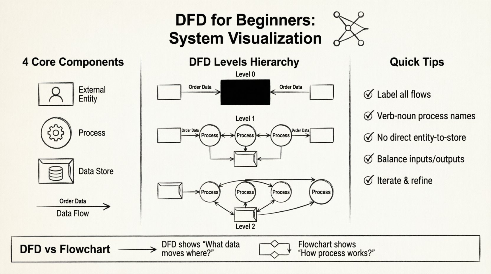
Every Data Flow Diagram is built using four fundamental symbols. While there are different notational styles, the underlying logic remains consistent. Understanding these building blocks is essential before drawing anything.
External entities represent people, organizations, or other systems that interact with the system you are diagramming. They are the “outsiders” who provide input or receive output. They sit outside the boundary of your system.
Processes are the actions that transform incoming data into outgoing data. This is where the “work” happens. A process takes input, does something with it, and produces an output.
Data stores represent places where information is held for future use. This could be a physical file, a database table, a folder, or even a filing cabinet. Unlike entities, these are part of the system boundary.
Data flows show the direction of data movement between entities, processes, and stores. They represent the actual data packets being transmitted.
There are two main schools of thought regarding how to draw DFDs. While the logic is the same, the shapes differ slightly. Knowing the difference helps you read diagrams created by others.
| Component | Yourdon & DeMarco | Gane & Sarson |
|---|---|---|
| Process | Circle | Rounded Rectangle |
| External Entity | Square | Rectangle |
| Data Store | Open Rectangle | Open Rectangle (sides) |
| Data Flow | Line with Arrow | Line with Arrow |
Both styles are valid. The choice often depends on the organization’s existing standards. As a beginner, focus on the logic rather than the specific geometry.
One of the most powerful features of DFDs is the ability to zoom in and out. This is known as “decomposition” or “balancing.” You start with a high-level view and break it down into smaller, more detailed views.
This is the highest-level view of the system. It shows the system as a single process and maps its interactions with external entities. It answers the question: “What is the system’s main purpose?”
In this level, the single process from the Context Diagram is exploded into major sub-processes. This reveals the main functional areas of the system.
Level 2 takes a specific process from Level 1 and breaks it down further. You can go to Level 3, Level 4, and so on, until you reach a level of detail that is manageable for developers or operators.
It is crucial to maintain consistency across these levels. This is called “balancing.” If a Level 1 process produces an output, the sub-processes in Level 2 must account for that output.
Creating a DFD is an iterative process. You rarely get it right the first time. Follow these steps to build a solid foundation.
Decide what is inside the system and what is outside. This defines your context. Everything inside is part of the system; everything outside is an entity or an external system.
Who interacts with the system? List them down. Consider users, other systems, and external data sources. Give each a clear name.
What are the main functions of the system? These are the verbs. For example, “Process Order,” “Manage User,” or “Generate Report.”
Connect the entities and processes with arrows. Label each arrow with the specific data being moved. Ensure every process has at least one input and one output.
Identify where information needs to be saved. Draw connections between processes and stores. Remember, data flows can go both ways (read/write).
Check for errors. Are there any orphaned flows? Are all labels clear? Does the diagram match the reality of how the system works? Iterate as needed.
Even experienced practitioners make mistakes. Being aware of common pitfalls will save you time and confusion.
These two diagrams are often confused, but they serve different purposes.
If you need to show the algorithm, use a flowchart. If you need to show the architecture of information, use a DFD.
Clear naming is the backbone of a readable diagram. Ambiguity leads to errors in development and implementation.
Always use a verb-noun structure. This makes the action clear.
Use nouns that describe the specific content of the flow.
Name the store based on the content it holds, not the physical file name.
DFDs are versatile and apply to many different domains. Here are a few examples of how they are used.
A DFD helps map the journey from browsing to checkout. It shows how customer details move from the registration page to the database, how order details move to the inventory system, and how payment confirmation flows back to the user.
In a clinic, patient data must flow securely between reception, doctors, and billing. A DFD ensures that sensitive data is only accessed by authorized processes and stored correctly.
For a company generating monthly reports, a DFD maps how data is pulled from various departments, aggregated in the central system, and distributed to management.
Do not expect your first draft to be perfect. DFDs are living documents. As requirements change, the diagram must change. This is not a sign of failure; it is a sign of a healthy design process.
When a stakeholder points out a missing requirement, update the diagram. When a process is simplified, redraw the flows. This iterative approach ensures the documentation remains accurate over time.
To wrap up, here are the essential points to remember when working with Data Flow Diagrams:
By mastering these concepts, you gain a valuable skill for system analysis. You become better at communicating complex ideas and ensuring that the systems you design or analyze function as intended. Whether you are a developer, a business analyst, or a project manager, the ability to visualize data flow is an asset that will serve you throughout your career.
Start small. Pick a simple system in your daily life, like a coffee shop ordering process, and try to draw a DFD for it. Practice the symbols, test the flows, and see how the clarity improves. With time, the structure will become second nature.
Remember, the goal is understanding, not perfection. Use these diagrams as tools for conversation and insight. Happy diagramming! 🎨✨