 Visual Paradigm Desktop |
  Visual Paradigm Online


In the architecture of software systems, few artifacts carry as much weight as the Data Flow Diagram (DFD). While technical specifications and code repositories are vital, the DFD serves as the universal translator between business logic and engineering implementation. It bridges the gap where requirements end and execution begins. When an analyst draws a process, they are not merely illustrating data movement; they are defining the contract of interaction between system components. For developers, this diagram is the blueprint that informs database schema, API endpoints, and processing logic.
This guide explores the practical application of Data Flow Diagrams in professional settings. We will examine how these diagrams function as communication tools, the specific notation standards used to ensure clarity, and the common friction points that arise between analysts and developers. By understanding the mechanics of DFDs beyond theoretical definitions, teams can reduce ambiguity and build systems that align with business intent.
Before diving into collaboration strategies, it is essential to establish a shared vocabulary. A Data Flow Diagram is a graphical representation of the flow of data through an information system. Unlike a flowchart, which depicts control flow and decision logic, a DFD focuses strictly on data transformation and movement. Every element in the diagram has a specific semantic meaning.
When these elements are combined, they form a map of the system’s information architecture. The accuracy of this map depends on the precision of the labels and the logical consistency of the connections.
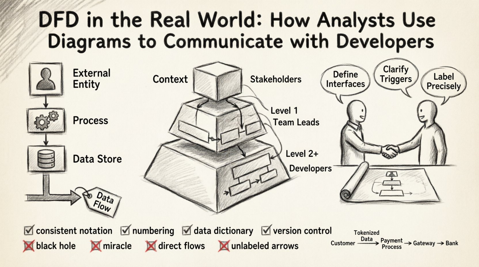
Effective DFDs are rarely created in a single pass. They evolve through levels of abstraction, allowing stakeholders to understand the system at varying degrees of granularity. This hierarchy is crucial for managing complexity during developer handoffs.
This is the highest level view. It shows the system as a single process and its interaction with external entities. It defines the system boundary clearly. For a developer, this diagram answers the question: “What does this system talk to?” It establishes the scope and prevents scope creep by visually defining what is inside and what is outside.
Here, the central process is exploded into major sub-processes. This level reveals the internal structure without getting bogged down in every single logic gate. It is often the first diagram shared with senior developers to discuss architectural splits. It helps identify which modules might need to be independent services or distinct database tables.
These diagrams drill down into specific sub-processes. This is where the detailed logic resides. Developers often reference these when writing unit tests or implementing specific business rules. However, over-documentation at this level can become a maintenance burden.
| Diagram Level | Primary Audience | Key Purpose | Detail Granularity |
|---|---|---|---|
| Context | Stakeholders, Architects | Define Boundaries | High (System as one block) |
| Level 1 | Team Leads, Architects | Identify Modules | Medium (Major Sub-processes) |
| Level 2+ | Developers, QA | Define Logic | Low (Specific Data Transformations) |
Even with a well-drawn diagram, miscommunication is common. The analyst thinks in terms of business value and data integrity. The developer thinks in terms of latency, concurrency, and data types. The DFD is the meeting ground, but it requires translation.
To mitigate these issues, analysts should annotate diagrams with constraints. Developers should review diagrams for feasibility. This collaborative review should happen before coding begins.
Maintaining a DFD that remains useful throughout the development lifecycle requires discipline. A diagram that is not updated becomes a liability, misleading the development team and causing technical debt.
There are two primary schools of DFD notation: Yourdon/DeMarco and Gane/Sarson. While they differ slightly in shape (rounded vs. sharp corners for processes), the semantics remain largely the same. The entire team must agree on one standard. Mixing notations within the same project creates cognitive load and confusion.
Use a hierarchical numbering system for processes. For example, if the top-level process is 0, the first sub-process is 1.0, and its sub-process is 1.1. This allows for easy cross-referencing. If a developer mentions “Process 3.2,” the analyst immediately knows which part of the Level 1 diagram to look at.
A DFD should never exist in isolation. It must be paired with a Data Dictionary. This document defines every data element used in the arrows. It specifies the data type, length, and constraints (e.g., “Email Address: String, Max 255, Unique”).
Just like code, diagrams change. A feature update might add a new data flow or alter a process. These changes must be tracked. Teams should maintain a history of diagram versions. When a developer asks, “When did we add the payment flow?”, the version history provides the answer.
Even experienced practitioners make mistakes. Recognizing these patterns early saves significant time during the coding phase.
This occurs when a process has inputs but no outputs. It implies data is being created or consumed without a result. In a real system, this often indicates a missing notification, a logging requirement, or a database write that was forgotten.
This is the opposite of the black hole. A process has outputs but no inputs. It implies data appears out of nowhere. In practice, this usually means the data source was omitted from the diagram, such as a default value or a system clock.
Data should not flow directly from one external entity to another without passing through the system. If a user sends data to another user, it must go through a process that validates and routes it. Direct flows bypass security checks and business logic.
Arrows without labels are useless. They force the developer to guess what is being transmitted. If a flow is labeled “Data,” it is too vague. Use specific nouns that describe the content.
A DFD is a living document. It should evolve alongside the software. The initial diagram is a hypothesis of how the system works. As developers build and test, the reality may differ. The diagram must be updated to reflect the actual implementation.
This iterative process involves:
To illustrate the practical application, consider a payment processing module. The external entities are the Customer, the Payment Gateway, and the Bank. The system receives a “Payment Request” from the Customer.
Scenario A: Poor Communication
The analyst draws a process called “Process Payment.” The developer assumes this handles the credit card directly. The diagram does not show the Bank. The developer builds a solution that stores card details, violating security compliance because the DFD did not show the requirement to offload to a gateway.
Scenario B: Effective Communication
The analyst draws the “Process Payment” sub-process. It shows a flow to the Payment Gateway (External Entity) labeled “Tokenized Card Data.” It shows a return flow labeled “Transaction Status.” The Data Dictionary defines “Tokenized Card Data” as a reference ID, not raw numbers. The developer knows immediately to use an API integration rather than building storage logic.
The second scenario prevents a security breach. The diagram acted as a constraint, guiding the developer toward the correct architectural decision.
For developers, the DFD is a direct precursor to technical decisions. Every arrow represents a network call, a database query, or a memory read/write.
The value of a Data Flow Diagram lies not in its aesthetic appeal, but in its ability to reduce ambiguity. It forces the analyst to think about where data comes from and where it goes. It forces the developer to understand the system’s intent before writing a single line of code.
When used correctly, the DFD is a silent partner in development. It does not shout for attention, but it ensures that the foundation is solid. Teams that invest time in accurate, maintained, and collaborative DFDs will find their development cycles are smoother, with fewer reworks and fewer misunderstandings. The effort put into the diagram pays dividends in the stability and maintainability of the final product.
By adhering to standard notations, maintaining data dictionaries, and treating the diagram as a living artifact, organizations can ensure that the communication between analysis and engineering remains clear, precise, and effective. This alignment is the backbone of successful system architecture.