 Visual Paradigm Desktop |
  Visual Paradigm Online


Legacy systems often function as critical infrastructure for organizations, yet they frequently exist as black boxes. Codebases may have been written decades ago, with documentation lost, outdated, or never created in the first place. When a modern team needs to understand, refactor, or migrate these systems, the lack of visibility creates significant risk. This is where the Data Flow Diagram (DFD) becomes an indispensable tool. 📊
A DFD provides a visual representation of how data moves through a system, independent of the specific programming language or database technology. For legacy analysis, it strips away implementation details to reveal the core business logic. This guide outlines a structured, practical approach to leveraging DFDs for understanding and modernizing older architectures without relying on hype or theoretical fluff.
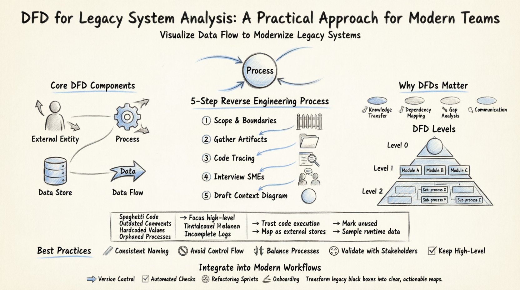
Before diving into legacy analysis, it is essential to establish a shared understanding of the tool itself. A Data Flow Diagram is a graphical representation of the flow of data through an information system. Unlike a flowchart, which focuses on control flow and decision logic, a DFD focuses on data movement. It maps the inputs, processing, storage, and outputs of a system.
The core components of a DFD include:
When analyzing a legacy system, the goal is not necessarily to create a perfect, textbook-standard diagram immediately. The goal is to create a map that allows the engineering team to navigate the complexity of the existing codebase.
Modern development practices emphasize agility and speed, but legacy systems often move in slow motion. Why invest time in creating diagrams for old code? Here are the primary reasons:
Creating a DFD for a legacy system is a process of reverse engineering. You are working backward from the output to understand the input and processing. This requires a disciplined approach to avoid getting overwhelmed by the complexity.
Start by defining what is inside the system and what is outside. For a legacy application, the boundary might be the application server, or it might include the database and the middleware. Clearly marking the boundary prevents scope creep during the analysis. 🚧
Search for any existing documentation, even if it is outdated. Look for:
These documents provide the baseline for your initial diagram. 📂
Use static analysis tools to trace data paths. Identify entry points (controllers, main functions) and follow the data through the logic. Look for:
This step often requires deep code inspection rather than high-level assumptions. 🧐
If any original team members remain, interview them. Ask questions like:
Human context fills in gaps that code cannot explain. 👥
Begin with the highest level view. This shows the system as a single process and its interactions with external entities. This establishes the scope before diving into details. 🌐
DFDs are hierarchical. Moving from high-level to low-level allows you to manage complexity. In a legacy analysis, you might not need to map every single line of code, but you should map the critical paths.
This is the top-level view. It contains one process representing the entire system. It shows the major inputs and outputs. This is useful for stakeholders to understand the system’s perimeter.
This breaks the main process into major sub-processes. For a legacy system, these might correspond to major functional modules (e.g., Billing, Inventory, Reporting). This level helps identify which parts of the monolith can be separated or modularized. 🧩
This dives deeper into specific sub-processes. It is useful for debugging specific data issues or understanding complex transformations. However, be cautious of creating too many diagrams, as they become difficult to maintain. 📄
Working with legacy systems presents unique hurdles. Below is a breakdown of common issues and practical strategies to overcome them.
| Challenge | Impact on Analysis | Practical Solution |
|---|---|---|
| 🧩 Spaghetti Code | Hard to trace data flow logic. | Focus on high-level modules first; ignore low-level logic until necessary. |
| 📅 Outdated Comments | Code comments may contradict current behavior. | Ignore comments; rely on actual code execution paths and database states. |
| 🔒 Hardcoded Values | Configuration is buried in code. | Identify all hardcoded paths and map them as external data stores in the DFD. |
| 👻 Orphaned Processes | Logic exists but is never called. | Mark these as “Unused” in the diagram to aid in cleanup planning. |
| 📉 Incomplete Logs | Hard to trace historical data flows. | Use current runtime data sampling to infer flow patterns. |
Creating a DFD is not a one-time event. It must fit into the modern development lifecycle. Here is how to keep the analysis relevant:
To ensure the DFD remains a useful asset rather than a burden, adhere to these best practices:
The greatest risk to a DFD is obsolescence. A diagram that is created once and never touched will eventually become a lie. To prevent this:
Legacy systems are complex by nature. They accumulate features over time, often without a cohesive design strategy. The DFD helps untangle this web. By visualizing the data, you can spot:
It is important to remember that a DFD is a model, not the system itself. It is a simplification. The goal is to capture enough detail to be useful without getting lost in the minutiae. If the diagram becomes as complex as the code, it has failed its purpose. Simplicity is the ultimate sophistication. 🎨
Implementing a DFD strategy for legacy system analysis is a marathon, not a sprint. It requires patience, attention to detail, and a willingness to engage with the code deeply. However, the payoff is substantial. Teams gain visibility, risk decreases, and the path to modernization becomes clearer.
By treating the DFD as a living document and integrating it into your standard engineering practices, you transform a static diagram into a dynamic asset. This approach ensures that the legacy system is understood, maintained, and eventually migrated with confidence. The code may be old, but the understanding it generates is modern and actionable. 🚀