 Visual Paradigm Desktop |
  Visual Paradigm Online


Systems analysis has long relied on visual representations to communicate complex logic. The Data Flow Diagram (DFD) remains a cornerstone of this practice. However, the landscape of software architecture has shifted dramatically. We have moved from monolithic applications to distributed microservices, from on-premise databases to cloud-native storage, and from synchronous requests to asynchronous event streams. The traditional DFD, designed for simpler, linear processes, faces new challenges in these environments. This guide explores how the methodology evolves to remain relevant, ensuring accurate modeling without becoming obsolete. 🛠️
Before examining the evolution, it is necessary to establish the baseline. A standard DFD visualizes the flow of information through a system. It focuses on what the system does, not how it does it. This distinction separates process modeling from structural design. The core components remain consistent across generations:
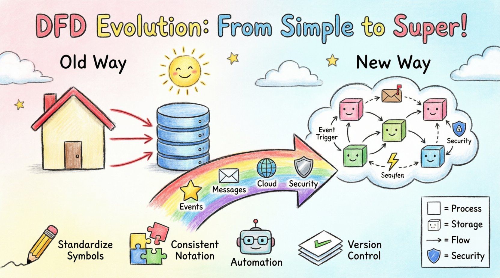
In the traditional context, these diagrams were hierarchical. A context diagram provided a high-level view (Level 0), which was then decomposed into detailed Level 1 and Level 2 diagrams. This worked well when a system had a clear beginning and end, and data moved predictably from input to output. However, modern systems often lack a single entry point or a definitive exit. Data enters and exits continuously, often in real-time. 🔄
The shift from monoliths to distributed systems introduces friction for static modeling. In a monolithic application, a database transaction might trigger a series of function calls that complete instantly. A DFD could draw a straight line from the database to the process to the output. In a microservice environment, the scenario is far more complex.
Modern systems frequently rely on message brokers and queues. A request is received, stored in a queue, and processed later by a worker. Traditional DFDs struggle to represent time. They imply immediate flow. A static arrow does not easily convey that data might sit in a buffer for hours before the next process engages. This leads to ambiguity in system behavior analysis.
Cloud architectures often utilize stateless containers that spin up and down. A DFD usually implies a permanent process. When a process is ephemeral, the diagram must clarify where the state is held (the data store) versus where the logic resides (the compute). If the diagram does not distinguish between the two, developers may incorrectly assume state is maintained within the process itself, leading to bugs.
Older models often treated data stores as generic boxes. Modern compliance requires understanding where data resides geographically and how it is encrypted. A DFD now needs to indicate data sovereignty and security levels. If a data flow crosses a security zone, the diagram should reflect that boundary, not just the logical connection.
To address these gaps, practitioners are modifying the standard notation to accommodate event-driven architecture (EDA). The core concept remains the flow of data, but the triggers change.
This adaptation requires a shift in perspective. The diagram is no longer just a map of the system; it is a map of the incidents that drive the system. It helps stakeholders understand the lifecycle of a piece of data from creation to final consumption, including the pauses in between. 🕒
As applications move to the cloud, the DFD must align with API contracts and service boundaries. The diagram serves as the bridge between business requirements and technical implementation.
Most modern systems expose an API Gateway. In a DFD, this replaces the generic “External Entity.” The Gateway becomes a specific process responsible for routing, authentication, and rate limiting. The diagram should show the transformation of the incoming request into an internal command. This clarifies the separation of concerns.
In distributed databases, data is often sharded. A traditional data store symbol is insufficient. The diagram should indicate that a process might query multiple shards to assemble a response. This visualizes the complexity of read operations versus write operations. For example, a write might go to one partition, while a read aggregates from three.
Services often do not know the network address of other services at design time. They discover them at runtime. A DFD can represent this by using a “Service Registry” node. Processes connect to the registry to find the current endpoint of a dependent service. This adds a layer of infrastructure visibility to the logical flow.
Understanding the differences helps teams choose the right level of abstraction. The following table outlines the key distinctions in how DFDs are constructed and interpreted today versus the past.
| Feature | Traditional DFD | Modern DFD |
|---|---|---|
| Flow Direction | Synchronous, immediate | Asynchronous, delayed, or batched |
| Process Nature | Monolithic, long-running | Microservice, ephemeral, stateless |
| Storage | Centralized database | Sharded, distributed, or object storage |
| Triggers | Input data arrival | Events, messages, or scheduled tasks |
| Boundaries | System perimeter | Security zones and API gateways |
| Concurrency | Often ignored | Explicitly modeled (queues, locks) |
As the diagrams become more complex, readability becomes a risk. The following practices ensure the DFD remains a useful tool rather than a confusing artifact.
Security is no longer an afterthought. It must be embedded in the design phase. A DFD is an excellent tool for identifying security risks by visualizing where data is exposed.
Every time data crosses from one process to another, a trust boundary is crossed. In a modern system, this might be from a public API to an internal microservice. The DFD should highlight these boundaries. If a flow crosses a boundary without encryption or authentication, the diagram reveals a vulnerability immediately.
Not all data flows carry the same weight. Sensitive information like PII (Personally Identifiable Information) requires stricter handling. The diagram can use color coding or specific icons to denote sensitive flows. This ensures that when developers implement the logic, they prioritize encryption and access controls for those specific paths.
Regulations like GDPR or HIPAA dictate how data must be stored and moved. A modern DFD can map data flows to compliance requirements. For instance, a data store might be labeled “EU Region Only.” If a process pulls data from this store to another region, the diagram flags a potential compliance violation. This allows architects to fix issues before writing code.
One of the biggest challenges with DFDs is maintenance. As code changes, the diagram often becomes outdated. Modern workflows aim to bridge this gap through automation.
While fully automated diagrams are not yet perfect, they provide a baseline that is much closer to reality than a static document created months ago. This keeps the documentation relevant as the system iterates. 🔄
The evolution of DFDs is ongoing. As technology advances, so do the modeling techniques.
Machine learning models introduce non-deterministic flows. A process might output different results based on probability rather than fixed logic. Future DFDs may need to represent confidence intervals or training data flows separately from inference data flows. This adds a new dimension to the data store and process nodes.
Static diagrams are good for design, but what about operations? Future iterations might link diagrams to live dashboards. If a data flow is blocked in production, the corresponding arrow in the diagram could light up red. This creates a living document that reflects the system’s current health.
There is currently no universal standard for representing events in DFDs. As the industry converges on specific event patterns (like CQRS or Event Sourcing), a standardized symbol set will likely emerge. This will make diagrams interoperable across different teams and organizations.
To begin adapting your current modeling practices, follow this general sequence.
The Data Flow Diagram has survived decades of technological change because its core purpose remains valid: clarity. While the notation must stretch to accommodate microservices, cloud infrastructure, and asynchronous events, the fundamental goal of visualizing data movement remains unchanged. By updating the symbols and the mental model behind them, teams can continue to use DFDs as a primary tool for system analysis. The evolution is not about replacing the method, but refining it to fit the complexity of the modern digital landscape. 🌐