 Visual Paradigm Desktop |
  Visual Paradigm Online


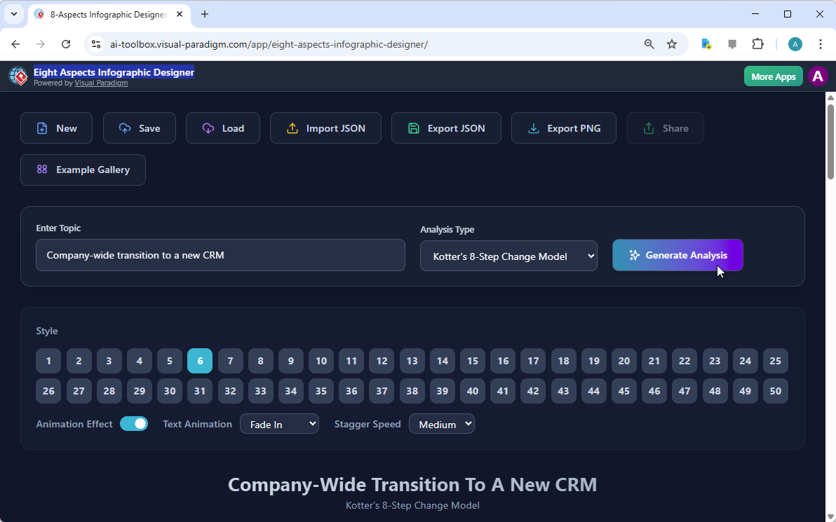
Every professional knows the overwhelming sensation of staring at a blank screen when a massive project looms on the horizon. If you are currently tasked with a complex initiative, such as a company-wide transition to a new CRM system, you might feel like you are attempting to climb a mountain without a map. Fortunately, the best AI-powered infographic maker is here to act as your digital guide and transform your strategic thoughts into a beautiful, organized visual masterpiece. Visual Paradigm Online has developed the Eight Aspects Infographic Designer to ensure that your ideas are never lost in a sea of disorganized bullet points or confusing spreadsheets. As we can observe in our first visual reference, the interface is remarkably inviting and encourages you to simply describe your problem to begin the magic of visualization.
The beauty of this application lies in its simplicity and the intelligent way it structures information for our human brains to process. In the first image, we see a user entering a specific topic—a company-wide transition to a new CRM—and choosing a professional framework known as Kotter’s 8-Step Change Model. By selecting a predefined analysis type, you are essentially giving the artificial intelligence a set of architectural blueprints to follow. You do not need to be a design expert or a master of strategic theory to produce something that looks like it came from a high-end consulting firm. The tool handles the heavy lifting, allowing you to focus on the actual strategy rather than struggling with alignment and font sizes.
Instant AI Generation: Simply provide a topic, and the artificial intelligence populates all eight sections with relevant, high-quality content.
Versatile Frameworks: You may choose from popular strategic models such as SWOT, PESTLE, Kotter’s 8 Steps, or Porter’s Five Forces.
Extensive Style Library: There are 50 unique visual styles available to ensure your infographic matches your brand or presentation aesthetic perfectly.
Interactive Sharing: You can generate a unique URL to share a professional “viewer mode” version of your work with colleagues or clients.
Full Creative Control: While the AI provides a robust starting point, you maintain the ability to edit every word and customize every animation.
You might wonder why the number eight is so significant in the world of professional analysis. The answer is quite simple: eight sections provide enough room to be comprehensive without becoming so cluttered that your audience falls asleep during your presentation. This professional eight aspects infographic software specializes in dividing complex topics into eight digestible “bites.” Whether you are looking at the strengths and weaknesses of a product or the external factors affecting your business, having a structured canvas ensures that you do not miss a single critical dimension of your analysis. It is like having a very organized assistant who reminds you to check every corner of the room before you leave.
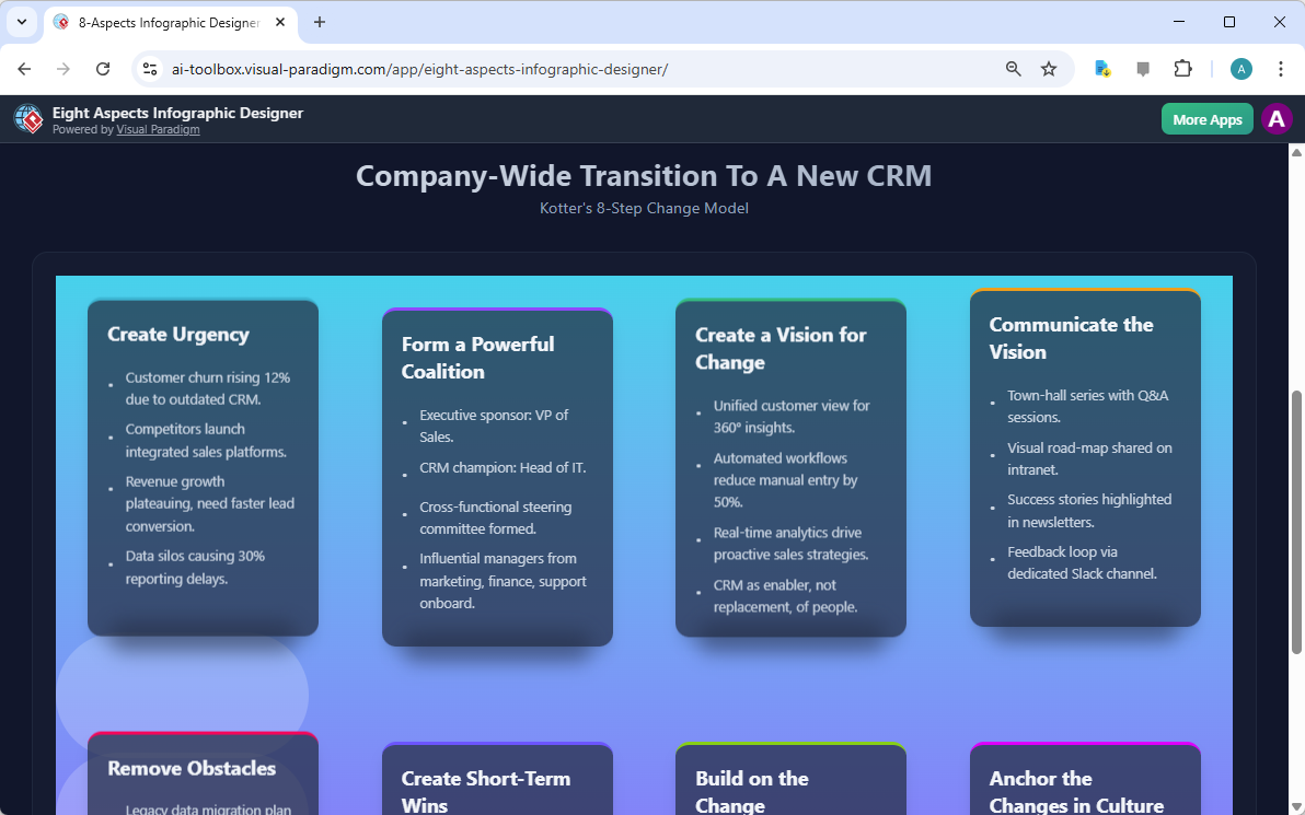
Once you have clicked that “Generate Analysis” button, the transformation is truly a sight to behold. In our second image, we see the actual result of the AI’s hard work. The “Company-Wide Transition to a New CRM” is no longer just a sentence; it has become a vibrant, multi-layered infographic. The tool has automatically populated the steps of Kotter’s model, such as “Create Urgency,” “Form a Powerful Coalition,” and “Create a Vision for Change.” The AI even suggests specific points, like “Customer churn rising 12% due to outdated CRM,” which helps you articulate the necessity of your project. This feature is particularly wonderful for overcoming creative blocks when you know what you want to say but cannot quite find the right words to express it.
Static images are certainly useful, but in our modern digital world, a little bit of movement can go a long way in capturing attention. This easy-to-use online analysis tool allows you to apply various text animations, such as “Fade In” or “Slide Up.” Imagine presenting your CRM transition plan to your board of directors; as you speak about each step, the text elegantly appears on the screen, creating a sense of rhythm and importance. You can even adjust the “Stagger Speed” to ensure the information flows at exactly the right pace for your speaking style. It is almost like being the director of your own tiny business movie, where every frame is designed to impress your audience.
Furthermore, the variety of styles is truly impressive. As noted in the interface, there are 50 different styles to choose from. Some are sleek and modern with dark backgrounds, while others are bright and energetic with soft gradients. This variety ensures that your infographic will never look like a generic template that everyone else is using. You can experiment with different layouts until you find the one that resonates with your specific message. If you decide that a certain point needs a personal touch, you can click directly on the text to refine the AI-generated content. You are the final editor of this masterpiece, ensuring that every detail is factually accurate and perfectly phrased.
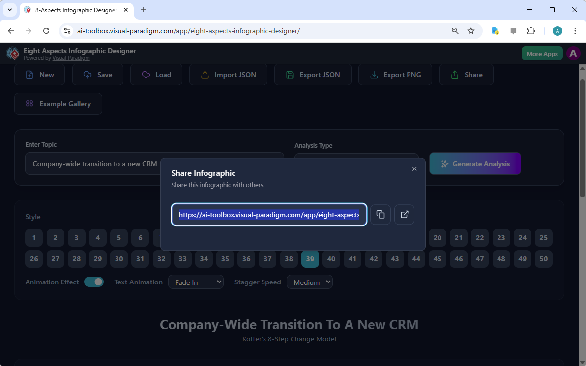
One of the most frustrating parts of professional collaboration is dealing with large file attachments or worrying if your recipient has the right software to open your document. This AI-powered analysis tool solves that problem quite elegantly through its cloud-based sharing system. Once you have saved your project to the cloud, you can generate a unique link, as seen in our third visual reference. This link allows anyone to view your infographic in a dedicated “viewer mode.” This mode is fantastic because it hides all the editing buttons, presenting your work in a clean, professional, and interactive format that works on almost any device with an internet connection.
This sharing feature is particularly helpful for consultants who need to send quick updates to clients or project managers who want to keep their team aligned on a change management strategy. You do not have to worry about anyone accidentally deleting your hard work because the shared link is read-only. It is a seamless way to communicate complex ideas without any technical friction. If you prefer to have a local copy, the application also allows you to export your project as a JSON file or a PNG image, providing you with the flexibility to use your infographic in various reports and documents.
Because the logic behind the Eight Aspects Infographic Designer is based on universal strategic frameworks, it is suitable for nearly any field you can imagine. Business analysts can use it for competitive landscape mapping, while marketers might use it to visualize consumer trends. Even students and researchers find it immensely helpful for structuring their findings into a clear visual summary. The AI is remarkably clever; it understands the nuances of different topics and adjusts its suggestions accordingly. Whether you are launching a new app, managing a corporate merger, or analyzing the environmental impact of a factory, this professional design software adapts to your needs like a digital chameleon.
In conclusion, the journey from a complex idea to a professional presentation does not have to be a stressful one. By utilizing the best AI-powered infographic maker, you are giving yourself the gift of time and clarity. You can move from a simple topic description to a fully realized, animated, and shareable infographic in just a few minutes. This tool empowers you to be more strategic and communicative, ensuring that your valuable insights are heard and understood by everyone in your organization. Why settle for boring bullet points when you can present your vision with such style and precision?
Are you ready to transform your next big idea into a stunning visual reality? We invite you to explore the possibilities and see your data in a whole new light. You may begin your creative journey today by visiting the Eight Aspects Infographic Designer at Visual Paradigm Online. Simply follow the link below to launch the application and start building your first professional analysis with ease!
Try the tool now: Eight Aspects Infographic Designer
Learn more about the features: Visit the Official Information Page
Visual Paradigm 8-Aspects Infographic Designer Features: Explore the comprehensive features of Visual Paradigm’s 8-aspects infographic designer for creating structured professional diagrams.
AI-Powered 8-Aspects Infographic Designer Tool: Utilize advanced AI-driven tools to generate and customize 8-aspects infographics with efficiency and precision.
Release Notes: AI 8-Aspect Infographic Designer: Stay informed about the latest software updates and release notes for the AI-powered 8-aspect infographic design platform.
Understanding Kotter’s 8-Step Change Model: Learn about the eight essential steps defined by John Kotter for leading and sustaining successful organizational change.